
The FileMaker Button Bar is a brand new layout object added in FileMaker 14. It provides you a centralized place to configure a collection of buttons (including popover buttons). Two of the main use cases for the button bar would be using it to create a navigation bar or function bar.
Adding Button Bars to Layout
Adding a button bar to a layout is very similar to adding other layout objects. First, you need to go to layout mode. Then you can either go to “Insert” menu and choose “Button Bar” or use the “Button Bar Tool” on your status tool bar.
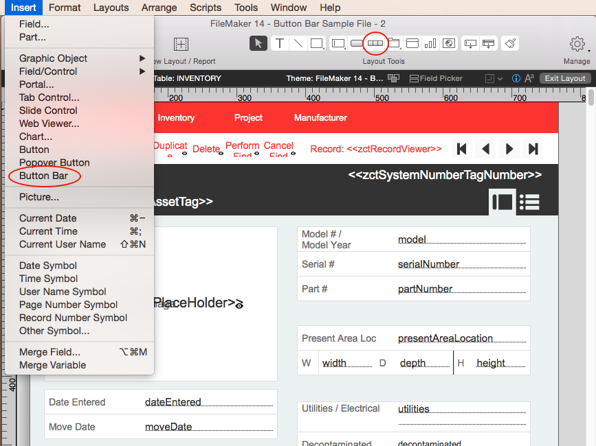
After you choose to insert a button bar you can specify the location and size of the button bar by clicking on your layout and dragging, similar to adding a tab control.
Button Bar Setup
Double clicking on a button bar will pop up the “Button Bar Setup” dialog. Since a button bar is a collection of buttons and popover buttons, the setup dialog for a button bar is quite similar to the one for buttons and popover buttons.
However there are parameters that are unique to a button bar setup. 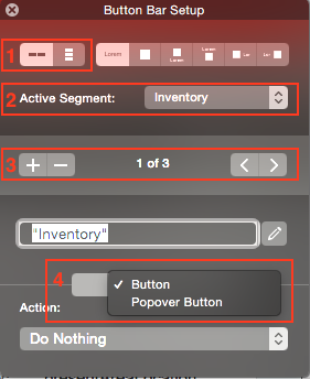
1. Alignment of segments (section 1 in screenshot to the right). This is used to specify the alignment of segments. Your segments in a button bar can either be aligned horizontally or vertically.
2. Active segment (section 2). This is used to select active segment. Active segment selection will affect the segments’ appearance. We will talk about that in the next section. One thing to notice about active segment selection is, you can use a calculation to choose the active segment dynamically. In the use case for navigation bar we can use this calculation to have the active segment be selected according to the context of the layout.
3. Add or delete segments and choose a specific segment (section 3). Choosing a specific segment allows you configure it using sections down below.
4. Type (section 4). Once a segment is selected, its type can be configured either as a button or a popover button using the drop down list shown in section 4. The rest of the button bar will change elements it contains to reflect this choice.
Button Bar Appearance
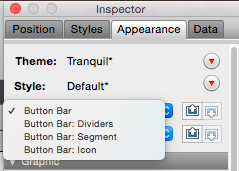 FileMaker provides great flexibility when it comes to setting the appearance of a button bar. Open the Inspector and go to the appearance tab. You will notice there are four components of a button bar’s appearance that you can configure: Button Bar, Button Bar: Dividers, Button Bar: Segment and Button Bar: Icon.
1.Button Bar component is mainly about the borders and outer shadows of a button bar. It will be applied to the whole button bar.
2. Button Bar: Dividers component, as its name describes, is about dividers between segments. You can specify top and bottom padding for dividers which will determine the height of them.
3. Button Bar: Segment component is about the currently selected segment. Different from a regular button, a button bar segment has five states: Active, Inactive, Hover, Pressed and In Focus.
The Active state is used to describe the appearance of a segment when it is the active segment. In contrast, the Inactive state is used to describe the appearance of a segment when it is not the active segment.
Earlier in the article, I mentioned that you can have a calculation to have the active segment selected according to the current context. Combining that with the active and inactive states, you will be able to reflect the current context on your navigation bar.
The other three states are quite common among layout objects. Refer to FileMaker’s Help Center for more information.
Keep in mind that any changes you make here will affect all the segments on the button bar.
4. Button Bar: Icon. Before we talk about the Button Bar: Icon comp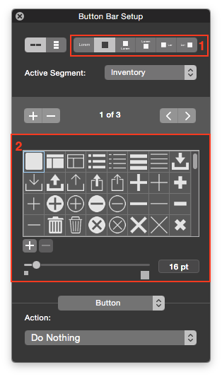 onent, let’s go back to the Button Bar Setup dialog and take a look at the section 1 on the picture to the right. This section allows users to specify the position of the button label and button icon. The first option is to display only a label. But the rest options all involve icons. You can choose an icon from hundreds of icons designed by FileMaker and put it on your button. Check out Emory’s article on Button Icons for more details. [link to Emory’s article]
You can use the Button Bar Setup dialog to specify the pattern and the size of your icon (section 2). But to specify the color of your icon you will need to go to the Inspector’s appearance tab and choose the Button Bar: Icon component.
The Button Bar: Icon component has the same five states as the Button Bar: Segment component and they behave in a very similar way.
Hiding a Segment
Hidden object behavior for a button bar is configured at the segment level. This means each segment can be hidden independently. So when a segment is hidden, the rest segments will resize to fill in the space left by it. In this way, you won’t have a gap on your button bar when you need to hide segment in some situations.
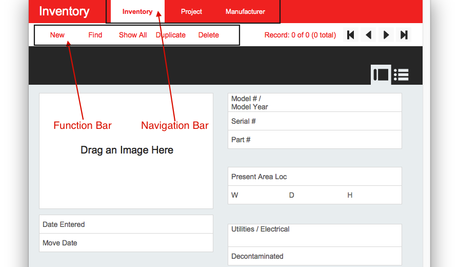
We will use a function bar as an example. We have segments that we only want to show in Browse Mode (“Find”, “Show All”, “Duplicate”), segments just for Find Mode (“Perform Find” and “Cancel Find”) and segments that work in both modes (“New” and “Delete”). After setting theirhiding conditions separately, here is what it looks like in Layout Mode: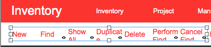
In Browse Mode the “Perform Find” and “Cancel Find” segments will hide and the rest segments will fill in their spaces.
In Find Mode the “Find”, “Show All” and “Duplicate” segments will hide.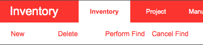
The total length of the button bar remains the same.
Autosizing
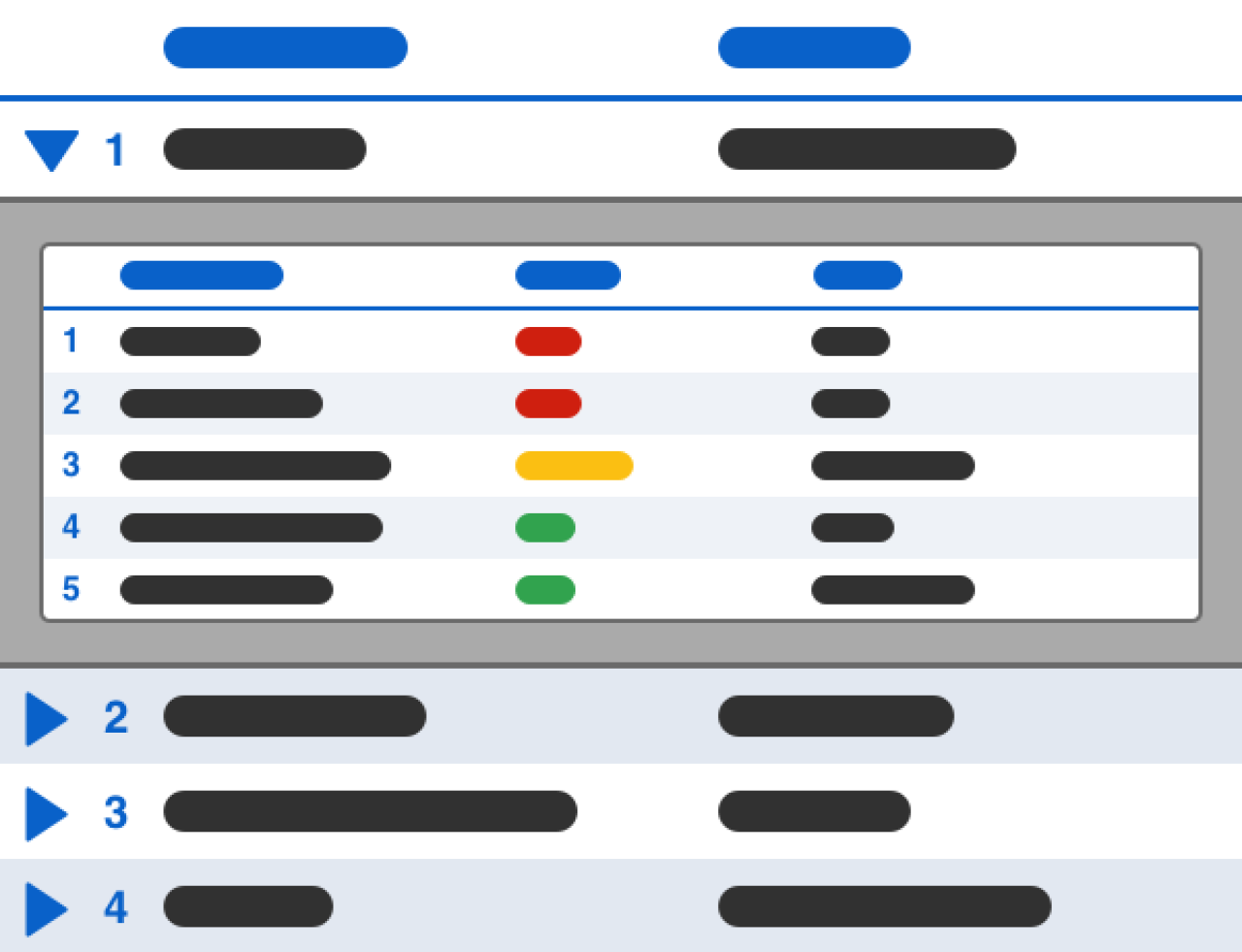
The button bar’s autosizing behavior makes it friendly for layouts designed for multiple screen sizes. If a horizontally aligned button bar is anchored to both left and right, when the screen width changes, each segment will resize itself evenly to fit in the new screen size. The same goes for a vertically aligned button bar that is anchored to the top and bottom.
As an example, the navigation bar below is anchored to both the left and right. Here’s what it looks like before we stretch the screen: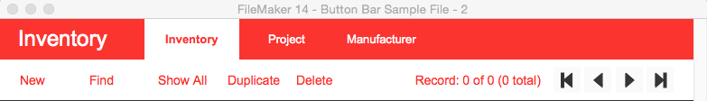
Here is what it looks like after we make the screen wider: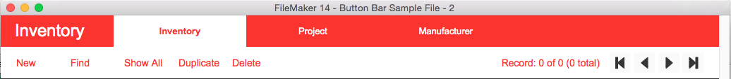
A use case for this would be using it in FileMaker Go solutions. If you place a button bar on a layout designed for FileMaker Go and set up its anchors properly, it will resize itself when the user rotates the screen. like the example above
Conclusion
The button bar is one of the new design tools that FileMaker 14 brings to us. By combining it with other new features of FileMaker 14, like Navigation Parts, it will help developers build a solution that looks and behaves more consistently with much less effort.
If you need help implementing the new button bar in FileMaker, please contact us.
Did you know we are an authorized reseller for Claris FileMaker Licensing?
Contact us to discuss upgrading your Claris FileMaker software.